Advertising always need not be expensive to win Awards
Creative Director : Amish Dash Sabrawal
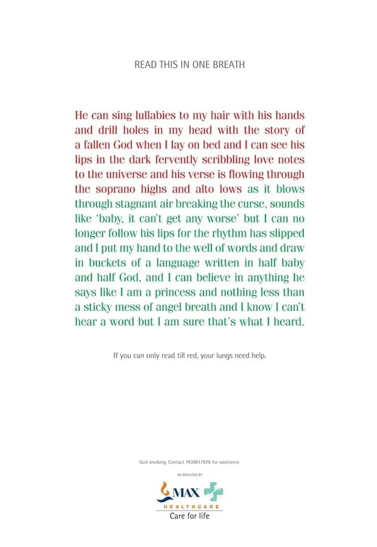
The "One Breath Poster" campaign is a textbook example of how creative advertising doesn’t always need to be expensive to be effective and win awards; it can be driven through a simple poster as well. This award-winning poster was created by Amish Sabharwal for Max Healthcare.
Campaign Objective
The campaign aimed to raise awareness about Chronic Obstructive Pulmonary Diseases (C.O.P.D.), particularly emphysema, which is directly linked to smoking. Emphysema leads to shortness of breath and a gradual reduction in lung capacity. Max Healthcare sought to address smokers by highlighting these long-term risks and encouraging them to quit smoking.
The Brief
A message that wouldn’t get lost in the noise of everyday life, and that would encourage smokers to take action.
The Challenge
Most smokers are aware that smoking is harmful but tend to ignore or downplay the risks. Traditional health messaging, which often involves shocking imagery of diseased lungs or warning labels, can be too easily dismissed. The challenge was to create a direct, real-time, physical experience that would make smokers confront the effects of smoking in a more personal and impactful way.
Creative Solution
The "One Breath Poster" is a brilliantly simple, self-diagnostic tool disguised as a poster. The campaign challenged smokers to read a block of text in one breath. The portion of text written in red represents the bare minimum that a healthy person with normal lung capacity should be able to read in one breath.

Why it worked
-
Strategic Placement: The posters were placed in locations where smokers were likely to see them:
- Smoking zones in corporate parks, where professionals often take breaks.
- Bars and cafes frequented by the youth, who are prime targets for anti-smoking campaigns.
- Outdoor locations near cigarette shops, where smokers often gather.
This ensured that the message reached smokers at the most relevant touchpoints—when they were either about to smoke or had just finished smoking.
-
Design and Copy: The design of the poster was strikingly simple but clever. The block of text had a poetic tone, describing a soothing yet ultimately harmful experience, much like smoking itself. The copy’s length was designed to test the reader’s lung capacity:
- The first portion of the text (written in red) was short enough for a healthy person to read in one breath.
- The subsequent portion (in green) was longer, symbolizing the difficulty that someone with reduced lung capacity would have in continuing.
- This visually and physically demonstrated the deterioration of lung capacity.
-
Call to Action: At the bottom of the poster, there was a hotline number that people could call to schedule a health check-up or seek help in quitting smoking. The copy read: “If you can only read till red, your lungs need help.”
This transformed the poster from a passive piece of communication into an active health check.
Get Amish & team to work for your Brand
Book a no obligation call today
Viral Campaign-The Power of Crowdsourcing
How an Olympic moment turned to a viral post
Turning a city into an invitation card - VR Activation
Can you get Gen Z to read a newspaper? - Times of India did.
How Powerful Copywriting can Elevate an Ad
Get ideas from the worlds most talented creative minds
Book a no obligation call today